It’s All about Responsive Design
 Responsive design—what is it?
It’s one of the things groov gives you: the amazing built-in ability to adapt your operator interface to any size screen.
You can see it in the HMI you build with groov: the gadgets and text all scale and move around as necessary to flow into the space provided by the device you’re viewing it on.
Applied to websites, a responsive design means you can comfortably see and navigate the website on your smartphone or tablet. Basically the site figures out what kind of device you’re on and adjusts to fit.
So when you look at the site, you don’t see unreadably tiny text and links you couldn’t possibly get your finger on. Instead, you get something you can actually use.
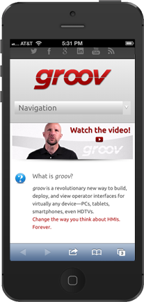
In fact the groov website is responsive. No kidding. Go to groov.com on your smartphone and see.
Comments are closed.