Read the white paper:
Building an HMI that Works: New Best Practices for Operator Interface Design
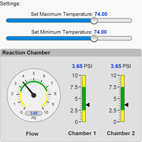
You’ll notice that a groov interface doesn’t include a lot of bells and whistles.
No fancy graphics, few bright colors. The gadgets are basic graphics—gauges, buttons, sliders, LEDs.
There’s a reason for this restraint. It turns out that fancy graphics obscure valuable information, and a lot of bright colors keep you from seeing what’s really important.

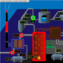
Bad HMIs
Frankly, a lot of HMIs don’t provide operators with the clear information they need to monitor and control their equipment.
In fact a lot of HMIs are pretty ridiculous—you can’t tell by looking whether the system’s OK or about ready to blow up. Could be important.
So what happens? Wasted time, wasted materials, lost production, damage to equipment, accidents.

High-performance HMIs
But a lot of study has been done on how to build an effective HMI, and groov was designed from the ground up with high-performance HMI principles in mind.
So groov encourages you to build an interface that works, especially for smaller mobile screens:
- Gadgets are clean and simple—no gel buttons or 3D effects.
- Background colors are muted, so the important data stands out.
- Data is presented in analog instead of digital form, so humans can understand it faster.
- Live data is colored dark blue to distinguish it from static text.
How do you use a groov interface?
It’s up to you. For a simple system or machine, you can build the entire operator interface in groov.
For a larger system, many people build mobile interfaces that supplement their existing HMIs, so the groov interface provides a subset of data or control to specific people.
High-performance HMI resources:
Want to learn more about effective HMIs?

